Using modern CSS and HTML, it has never been easier to create loading spinners of any kind. This article showcases over 40 different techniques and styles of pure CSS3 animations for creating any CSS loader your website may need.
What is a CSS Loading Spinner?
If you use a computer, you have already seen spinners multiple times. They are small animations used to indicate that something is loading and that the user needs to wait a bit. Your operating system, for example, displays a loading spinner when you launch a program. It indicates that the OS has understood the instruction and is in the process of launching the desired application. The user can then know that their request is being processed and that they just need to wait a bit for the program to be launched and operational.
On the Internet, spinners and loaders have always been used on sites and apps, with the same goal as their desktop counterparts. Years ago, loading spinners were mostly in the form of a .gif image. But as images tend to consume lots of bandwidth and generally slow down the loading speed of websites, web developers moved to a more efficient solution: Spinners in pure CSS.
Using a CSS animation instead of a .gif image, we can avoid the image request (which consumes bandwidth and slows down the site loading process) and have many more possibilities in terms of customization and maintenance.
CSS Loaders by Luke Haas
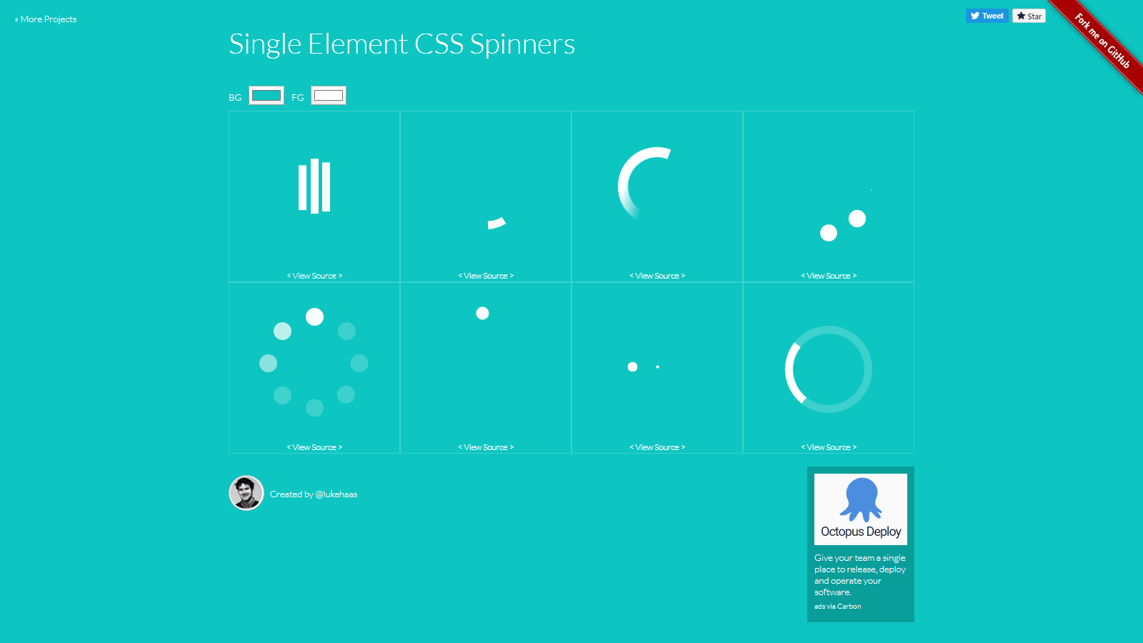
This nice collection of eight different CSS3 animations comes with demos and the source code. Every loading spinner from this collection is made in pure CSS and is easy to integrate in any website or app.
Let’s take a look at the code: In this example, I am featuring the 3rd spinner from the left, on the top row. The CSS and HTML isn’t really complicated. Here’s our HTML code:
<div class="loader">Loading...</div>
And the associated CSS:
.loader {
  font-size: 10px;
  margin: 50px auto;
  text-indent: -9999em;
  width: 11em;
  height: 11em;
  border-radius: 50%;
  background: #ffffff;
  background: -moz-linear-gradient(left, #ffffff 10%, rgba(255, 255, 255, 0) 42%);
  background: -webkit-linear-gradient(left, #ffffff 10%, rgba(255, 255, 255, 0) 42%);
  background: -o-linear-gradient(left, #ffffff 10%, rgba(255, 255, 255, 0) 42%);
  background: -ms-linear-gradient(left, #ffffff 10%, rgba(255, 255, 255, 0) 42%);
  background: linear-gradient(to right, #ffffff 10%, rgba(255, 255, 255, 0) 42%);
  position: relative;
  -webkit-animation: load3 1.4s infinite linear;
  animation: load3 1.4s infinite linear;
  -webkit-transform: translateZ(0);
  -ms-transform: translateZ(0);
  transform: translateZ(0);
}
.loader:before {
  width: 50%;
  height: 50%;
  background: #ffffff;
  border-radius: 100% 0 0 0;
  position: absolute;
  top: 0;
  left: 0;
  content: '';
}
.loader:after {
  background: #0dc5c1;
  width: 75%;
  height: 75%;
  border-radius: 50%;
  content: '';
  margin: auto;
  position: absolute;
  top: 0;
  left: 0;
  bottom: 0;
  right: 0;
}
@-webkit-keyframes load3 {
  0% {
    -webkit-transform: rotate(0deg);
    transform: rotate(0deg);
  }
  100% {
    -webkit-transform: rotate(360deg);
    transform: rotate(360deg);
  }
}
@keyframes load3 {
  0% {
    -webkit-transform: rotate(0deg);
    transform: rotate(0deg);
  }
  100% {
    -webkit-transform: rotate(360deg);
    transform: rotate(360deg);
  }
}
A few things to note about this CSS: First, notice the use of the pseudo-classes :before and :after. Then, you can spot @keyframes, which is used to create the loading animation. If you need more information about CSS animations, please refer to our CSS Tricks article.
Spinkit Loaders
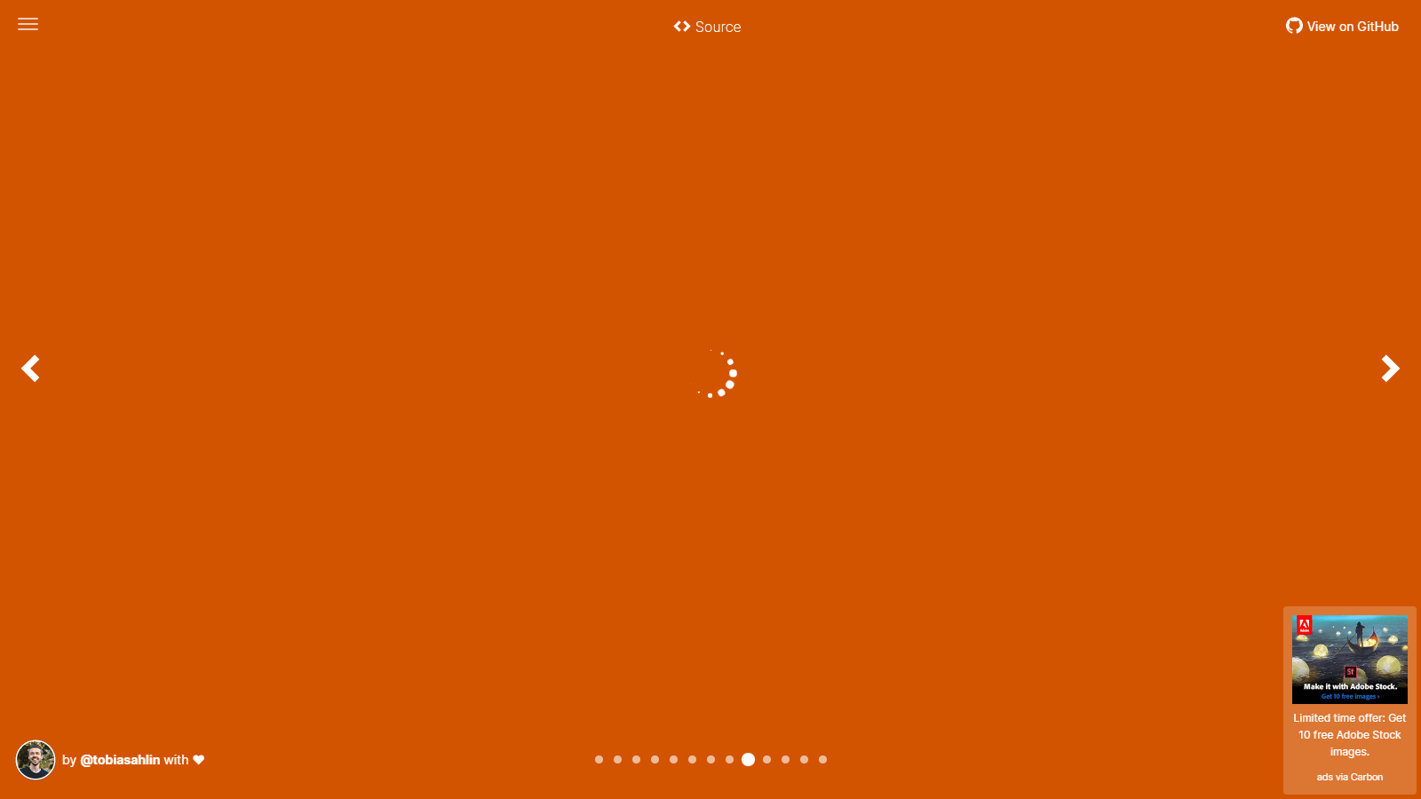
Let’s continue our round-up with these 12 pure CSS loaders, which are super easy to integrate in any kind of site. Each loading animation comes with the CSS and HTML source code that you can freely use in any of your projects.
Compared to Luke Haas’ loaders, these tend to be a bit complex and use much more CSS code.
→ More info/View sources
CSSLoad
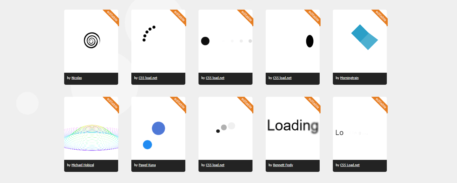
Probably the most complete library of the genre available on the Internet, cssload.net is an entire website dedicated to loaders of all kinds.
Not only this useful site lets you choose between over a hundred different styles of spinners, but you can also customize most of them. The output CSS and HTML code is clean, concise, and ready to use on your website or app.
→ More info/View sources
Loaders.css
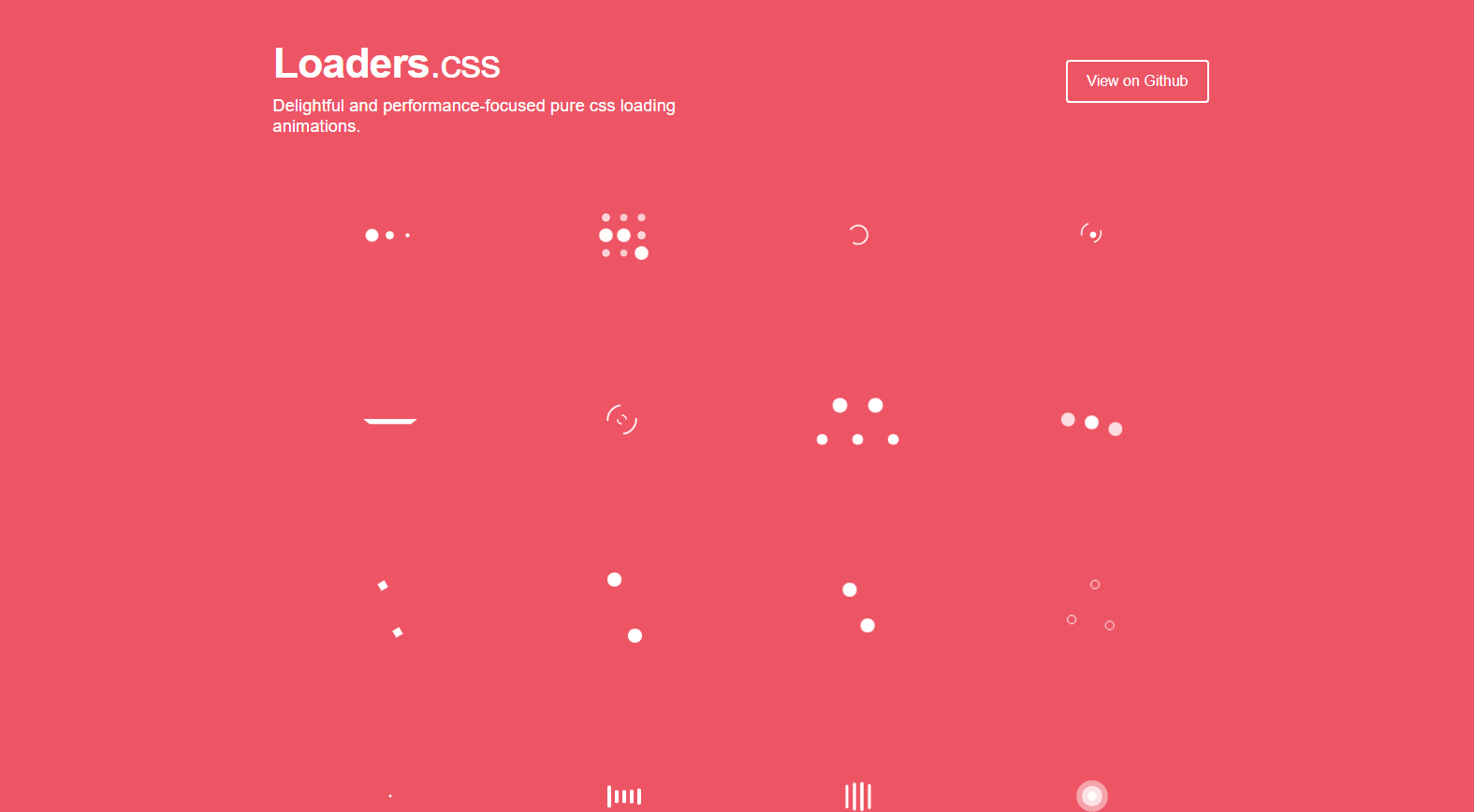
Delightful and performance-focused pure CSS loading animations. Over 25 different styles to choose from. This whole library features over 1700 lines of clean and simple CSS code that you are free to re-use in all your projects.
→ More info/View sources
SpinThatShit
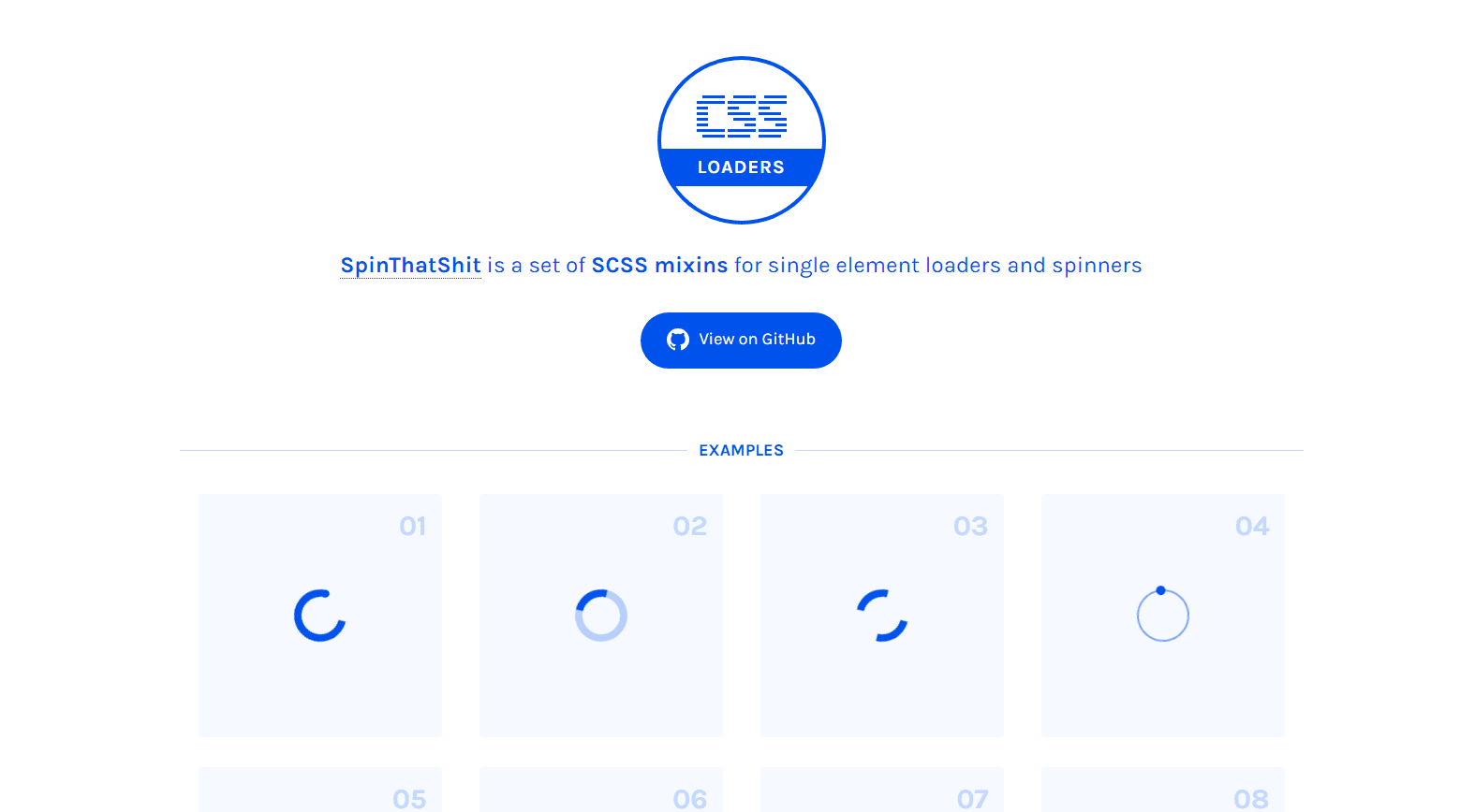
SpinThatShit is a set of SCSS mixins for single element loaders and spinners. If you like to use the SASS CSS preprocessor, this collection is definitely a good choice for your projects.
→ More info/View sources
Cleanest CSS spinner, ever
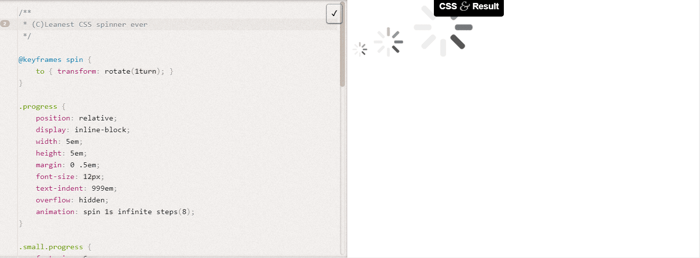
This spinner is quite old as it was first released in 2013. But despite this, it’s perfect in many ways, as it’s a simple CSS spinner that loads fast and is easy to use, modify and integrate.
Let’s have a look at the CSS animation code:
@keyframes spin {
	to { transform: rotate(1turn); }
}

.progress {
	position: relative;
	display: inline-block;
	width: 5em;
	height: 5em;
	margin: 0 .5em;
	font-size: 12px;
	text-indent: 999em;
	overflow: hidden;
	animation: spin 1s infinite steps(8);
}

.small.progress {
	font-size: 6px;
}

.large.progress {
	font-size: 24px;
}

.progress:before,
.progress:after,
.progress > div:before,
.progress > div:after {
	content: '';
	position: absolute;
	top: 0;
	left: 2.25em; /* (container width - part width)/2  */
	width: .5em;
	height: 1.5em;
	border-radius: .2em;
	background: #eee;
	box-shadow: 0 3.5em #eee; /* container height - part height */
	transform-origin: 50% 2.5em; /* container height / 2 */
}

.progress:before {
	background: #555;
}

.progress:after {
	transform: rotate(-45deg);
	background: #777;
}

.progress > div:before {
	transform: rotate(-90deg);
	background: #999;
}

.progress > div:after {
	transform: rotate(-135deg);
	background: #bbb;
}
The related HTML is very simple:
<div class="large progress"><div>Loading…</div></div>
This simple loading animation has been tested and works perfectly in Chrome, Firefox, Safari, and IE10. In older browsers such as IE9, it will degrade gracefully: The spinner will look fine but won’t be animated.
Frequently Asked Questions
How Do You Load a Spinner in CSS?
While the code itself depends on the type of CSS spinner you want to use, it always consists of two elements: HTML markup and CSS code. You can refer to this article, for example.
How Do You Animate a Pure CSS Loading Spinner?
CSS3 animations let an element gradually change from one style to another. You can change as many CSS properties you want, as many times you want. Please refer to our CSS Tricks article for more info about CSS animations.
How Do I Create a Progress Bar in Simple CSS?
Progress bars can be created either in pure CSS or by combining CSS and jQuery. You can check out our CSS Progress Bar tutorial for inspiration.
