The newest additions to both the HTML and CSS specifications allow web developers to craft beautiful and user-friendly components.
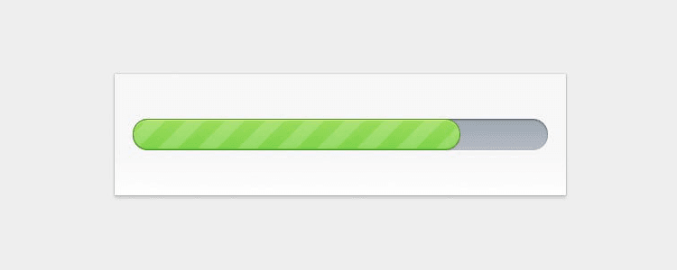
Amongst those components, progress/loading bars can contribute to making your website more enjoyable to use for your visitors. This complete front-end web development tutorial will show you how you can learn to create a fancy CSS/HTML5 progress bar.
The HTML and CSS source files of the finished progress bar can be downloaded from Github.
Getting Ready
Let’s start by organizing our work. For this tutorial, we will need to create 3 files:
progress.html, which will contain our markup.ui.csswhich will contain our CSS styles.progress.jswhich will contain some additional jQuery animations.
The first step is to create a new directory on your webserver or hard drive, and create the 3 files, which together will be the backbone of our HTML/CSS bar.
The HTML Markup
Here we go. Open your progress.html file and paste the following HTML markup in it:
<!DOCTYPE html>
<html>
<head>
	<meta charset="utf-8">
	<title>Pure CSS Progress Bar</title>

	<link rel="stylesheet" href="stylesheets/ui.css">
	<link rel="stylesheet" href="stylesheets/ui.progress-bar.css">
</head>
<body>
	<div id="container">
		<div id="progress_bar" class="ui-progress-bar ui-container">
        	<div class="ui-progress" style="width: 79%;">
				<span class="ui-label" style="display:none;">Processing <b class="value">79%</b></span>
      		</div><!-- .ui-progress -->
    	</div><!-- #progress_bar -->

		<div class="content" id="main_content" style="display: none;">
	    	<p>Hello, World!</p>
	  	</div><!-- #main_content -->
	</div><!-- #container -->
</body>
</html>
Let me explain the code a bit: On the first line, I’ve declared an HTML5 doctype. Then, lines 12 to 16 contains the markup for the progress bar itself. If you save the file and view it in your browser right now, you’ll see that nothing appears. Don’t worry, we’re going to apply some pure CSS magic in a minute.
Diving Into CSS
Once you’re done with the HTML part, open your ui.css file and paste the following CSS code in it.
There’s nothing fancy there, just some basic styles (that I’ve simplified from the original source) for the layout.
body {
  background:#eee;
  padding: 30px;
  font-size: 62.5%;
  font-family: 'Helvetica Neue', Helvetica, Arial, sans-serif;
  position: relative;
  margin: 0;
}

#container {
  margin: 0 auto;
  width: 460px;
  padding: 2em;
  background: #DCDDDF;

}

.ui-progress-bar {
  margin-top: 3em;
  margin-bottom: 3em;
}

.ui-progress span.ui-label {
  font-size: 1.2em;
  position: absolute;
  right: 0;
  line-height: 33px;
  padding-right: 12px;
  color: rgba(0,0,0,0.6);
  text-shadow: rgba(255,255,255, 0.45) 0 1px 0px;
  white-space: nowrap;
}
Then, we can finally get into more serious things. The code below will make your HTML/CSS progress bar come to life. I’ll explain how it works in a minute. For now, copy it and paste it in your ui.css file.
@-webkit-keyframes animate-stripes {
  from {
    background-position: 0 0;
  }

  to {
   background-position: 44px 0;
  }
}

.ui-progress-bar {
  position: relative;
  height: 35px;
  padding-right: 2px;
  background-color: #abb2bc;
  border-radius: 35px;
  -moz-border-radius: 35px;
  -webkit-border-radius: 35px;
  background: -webkit-gradient(linear, left bottom, left top, color-stop(0, #b6bcc6), color-stop(1, #9da5b0));
  background: -moz-linear-gradient(#9da5b0 0%, #b6bcc6 100%);
  -webkit-box-shadow: inset 0px 1px 2px 0px rgba(0, 0, 0, 0.5), 0px 1px 0px 0px #FFF;
  -moz-box-shadow: inset 0px 1px 2px 0px rgba(0, 0, 0, 0.5), 0px 1px 0px 0px #FFF;
  box-shadow: inset 0px 1px 2px 0px rgba(0, 0, 0, 0.5), 0px 1px 0px 0px #FFF;
}

.ui-progress {
  position: relative;
  display: block;
  overflow: hidden;
  height: 33px;
  -moz-border-radius: 35px;
  -webkit-border-radius: 35px;
  border-radius: 35px;
  -webkit-background-size: 44px 44px;
  background-color: #74d04c;
  background: -webkit-gradient(linear, 0 0, 44 44,
    color-stop(0.00, rgba(255,255,255,0.17)),
    color-stop(0.25, rgba(255,255,255,0.17)),
    color-stop(0.26, rgba(255,255,255,0)),
    color-stop(0.50, rgba(255,255,255,0)),
    color-stop(0.51, rgba(255,255,255,0.17)),
    color-stop(0.75, rgba(255,255,255,0.17)),
    color-stop(0.76, rgba(255,255,255,0)),
    color-stop(1.00, rgba(255,255,255,0))
  ), -webkit-gradient(linear, left bottom, left top, color-stop(0, #74d04c), color-stop(1, #9bdd62));
  background: -moz-repeating-linear-gradient(top left -30deg,
    rgba(255,255,255,0.17),
    rgba(255,255,255,0.17) 15px,
    rgba(255,255,255,0) 15px,
    rgba(255,255,255,0) 30px
  ), -moz-linear-gradient(#9bdd62 0%, #74d04c 100%);
  -webkit-box-shadow: inset 0px 1px 0px 0px #dbf383, inset 0px -1px 1px #58c43a;
  -moz-box-shadow: inset 0px 1px 0px 0px #dbf383, inset 0px -1px 1px #58c43a;
  box-shadow: inset 0px 1px 0px 0px #dbf383, inset 0px -1px 1px #58c43a;
  border: 1px solid #4c8932;
  -webkit-animation: animate-stripes 2s linear infinite;
}
Save your ui.css file and have a look to progress.html in your web browser. If you carefully followed the previous steps of this tutorial, you should see a gorgeous progress bar, done without using any image.
So, how does this code works in all browsers? Here is the explanation:
First, we have two CSS classes: .ui-progress-bar and .ui-progress. The first is the container, and the second is the progress element in itself.
- Lines 1 to 9: These lines define a webkit-specific animation, which allows us to move an element from a point to another. For more details about HTML and CSS webkit animations, see http://webkit.org/blog/324/css-animation-2/.
- Line 16: The
border-radiusCSS3 property allows you to define a radius and get rounded corners. - Line 17: Mozilla specific property for
border-radius. - Line 18: Webkit specific property for
border-radius. - Line 19: The -webkit-gradient property allows you to add a gradient to an element. It works only on Webkit, other browsers will ignore this property.
- Line 20: Mozilla specific property, similar to
-webkit-gradientwith a different syntax. - Lines 21 to 23:
box-shadow(and its browser specific alternatives) allows you to add a shadow to an element. - Line 34: Webkit specific property, based on the standard
background-sizeproperty, which allows you to specify the size of a background image. - Line 56: Triggers webkit animation defined on line 1.
Final Touches: Using jQuery to Animate Progress Bars
Pure CSS progress bars are a very cool thing, but as progress bars are meant to show progress to users, we now need to animate it. We’re going to use the HTML CSS JavaScript trio to do so. More specifically, we are gonna use jQuery.
Open your progress.html file and paste the two lines below just above the closing</body> tag.
<script src="http://ajax.googleapis.com/ajax/libs/jquery/1.4.2/jquery.min.js" type="text/javascript" charset="utf-8"></script>
<script src="progress.js" type="text/javascript" charset="utf-8"></script>
This code will load jQuery from Google as well as your progress.js file, which will contain the required code to animate the progress bar. Of course, you can use your self-hosted version of jQuery instead of the Google-hosted version if you prefer.
Now, paste the code below in your progress.js file:
(function( $ ){
  $.fn.animateProgress = function(progress, callback) {
    return this.each(function() {
      $(this).animate({
        width: progress+'%'
      }, {
        duration: 2000,

        easing: 'swing',

        step: function( progress ){
          var labelEl = $('.ui-label', this),
              valueEl = $('.value', labelEl);

          if (Math.ceil(progress) < 20 && $('.ui-label', this).is(":visible")) {
            labelEl.hide();
          }else{
            if (labelEl.is(":hidden")) {
              labelEl.fadeIn();
            };
          }

          if (Math.ceil(progress) == 100) {
            labelEl.text('Done');
            setTimeout(function() {
              labelEl.fadeOut();
            }, 1000);
          }else{
            valueEl.text(Math.ceil(progress) + '%');
          }
        },
        complete: function(scope, i, elem) {
          if (callback) {
            callback.call(this, i, elem );
          };
        }
      });
    });
  };
})( jQuery );

$(function() {
  $('#progress_bar .ui-progress .ui-label').hide();
  $('#progress_bar .ui-progress').css('width', '7%');

  $('#progress_bar .ui-progress').animateProgress(43, function() {
    $(this).animateProgress(79, function() {
      setTimeout(function() {
        $('#progress_bar .ui-progress').animateProgress(100, function() {
          $('#main_content').slideDown();
        });
      }, 2000);
    });
  });

});
Once you have saved the file, have a look to progress.html through your web browser: As you can see, the progress bar is now animated, thanks to jQuery as well as HTML and CSS.
This JavaScript code makes the progress bar go from 0 to 100. Once 100 is reached, a custom message is displayed. In this progress bar tutorial, a basic Hello World is shown. This message can be changed by editing the progress.html file.
Congratulations on completing this tutorial! Now, you know how to make HTML/CSS progress bars.
Frequently Asked Questions

How do I Change the Color of my Progress Bar in CSS?
You need to edit the background and background-color properties of the .ui-progress-bar class.
Are Progress Bars Included in Bootstrap?
Yes. Bootstrap provides web developers with a wide array of pure CSS and HTML/CSS/JavaScript progress bars. For more information, please have a look at this page.
Where Can I Find More CSS Examples?
CatsWhoCode provides a large number of CSS examples and tutorials. If you enjoyed our progress bar tutorial, you might also be interested in our CSS Transition guide.
